Why users engaged, but didn't convert
Owned the product page redesign, including structure and messaging
MY ROLE
Product Designer
TIMELINE
Sept 2024 – Jan 2025
TEAM
1 PM, 2 Engineers
IMPACT
23% of users showed intent
11% conversion rate (no change from control)
Context
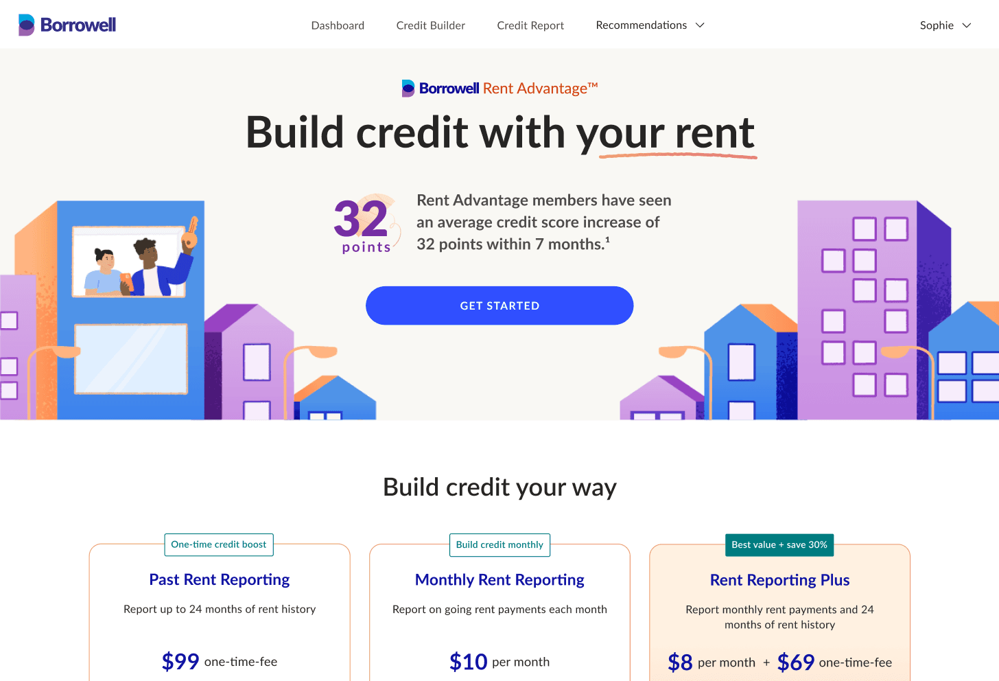
Borrowell's Rent Advantage product helps users build their credit score by reporting their rent to Equifax. Multiple payment plans were introduced, adding complexity to the product and its value proposition. I redesigned the product page to better highlight benefits, pricing and plan differentiators to improve adoption.
Hypothesis
Adding proof of credit-building impact and showing a real-world example of how a higher credit score benefits users would increase conversion.

Key design decisions
I focused on making the value of the product more visible and easier to understand:
To build trust and show social proof, I highlighted credit-building impact at the top of the page.
To demonstrate saving value with a higher credit score, I added a mortgage savings example.
To address perceived effort, I emphasized a quick 5-minute sign-up and clarified that no landlord involvement or credit check is required.
Despite these improvements, users still hesitated because they weren’t sure if the product applied to them.

What happened
The team had anticipated an increase in adoption, particularly the bundled option (ongoing monthly rent reporting + 24 months of historical reporting) that provides the most value. Despite the redesign, adoption didn’t improve.
While 23% of users showed intent, conversion remained at 11%, suggesting users were interested but hesitant to commit.
Even though users engaged with the page, they hesitated at the point of decision because they weren’t sure if the product applied to them or which plan to choose.
What we learned from user research
The User Researcher on my team conducted interviews, which showed that the issue wasn’t visibility or trust, but clarity.
Participants struggled to answer a fundamental question before committing: “Is this actually for me?”
Quote from a participant:
"For the pricing, the first is pretty clear, past rent history means it is past. The third doesn't say it's a combination of the above two plus 30% off.”
Two key gaps emerged:
Unclear eligibility
Participants weren’t sure if their situation qualified. A few of them mentioned that renting with roommates may cause problems reporting rent payments.Confusing plan differences
Participants couldn’t easily understand how the plans differed or which one to choose
Participants were interested, but lacked the confidence to move forward.

What I would do next
If I had the opportunity to continue iterating, I would focus on reducing decision friction
Clarify eligibility upfront by introducing a “Who is this for?” section to help users quickly assess if the product applies to their situation
Guide plan selection by simplifying plan names and highlighting key differences to reduce decision friction
Strengthen decision support by refining pricing hierarchy and supporting copy to make trade-offs between plans clearer
Validate through testing by running A/B tests and usability tests to understand if these changes improve confidence and conversion
Key takeaway
Users weren’t trying to understand the product. They were trying to understand if it applied to them.
This project shifted how I think about conversion problems. I initially approached this as a visibility issue, but learned that clarity and confidence are often bigger barriers than awareness. It reinforced the importance of validating assumptions earlier and designing for decision-making, not just engagement.