Clarity in a complex learning system
Leading a research-driven IA redesign to align system structure with user mental models and improve trust in system state
MY ROLE
Product Designer
TIMELINE
March 2026 – Present
TEAM
1 PM, 3 Engineers, QA
IMPACT
Introduced a user research process that informed the tool direction

Context
Workhub's internal Online Training tool is used by Content and Customer Success teams to build, manage and evaluate training courses. Over time, the system became increasingly layered due to its legacy structure and added functionality.
Users were also working across both internal and public-facing tools, depending on which workflows were easier to complete.
Problem
The tool was structured around system and backend logic rather than how users think about building and managing courses.
This created friction across core workflows:
Difficulty navigating between courses, lessons, versions and quizzes
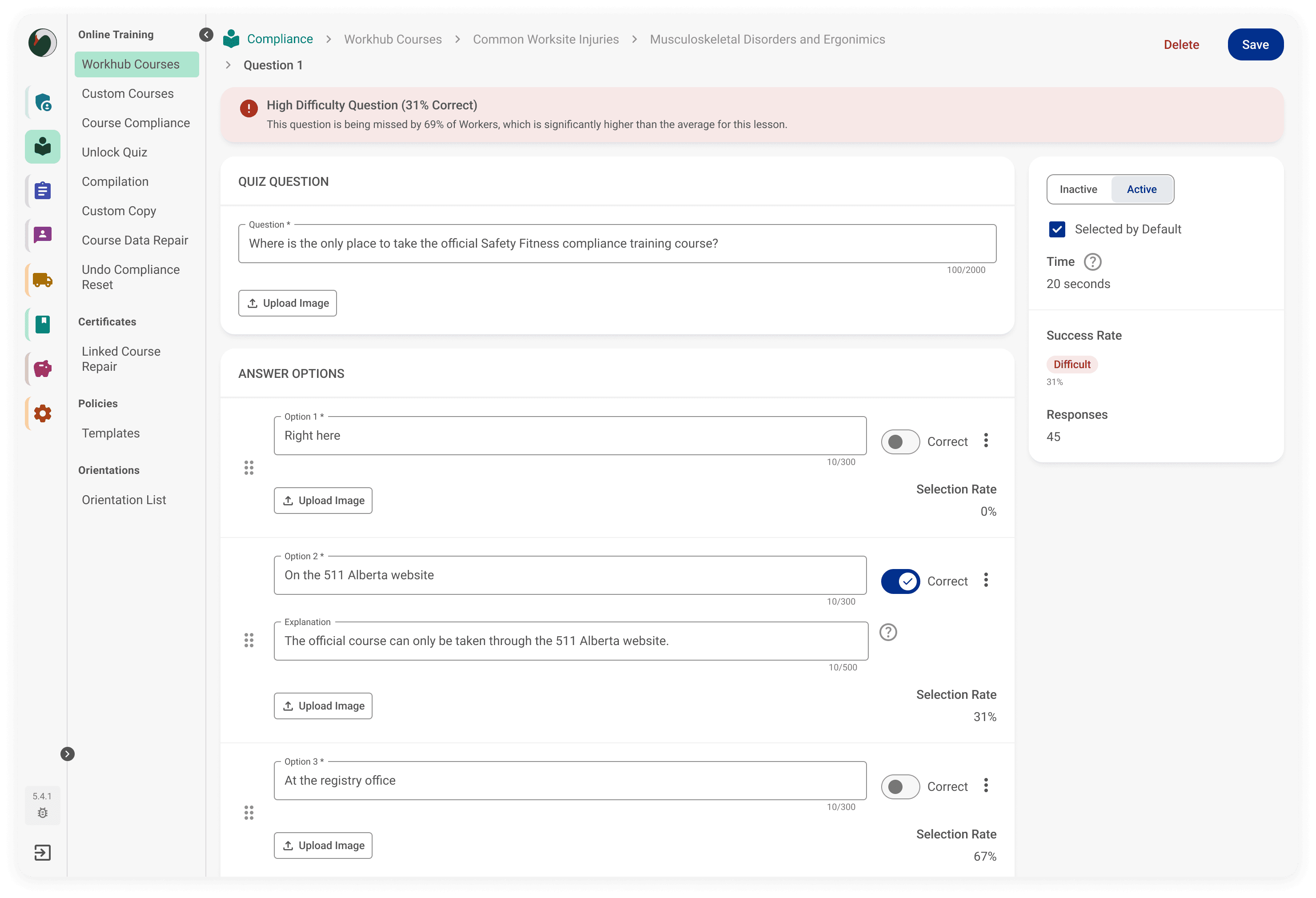
Buried performance insights like quiz success rates requiring manual investigation
Inconsistent understanding of where changes should be made
Uncertainty about whether actions like saving or updating had actually succeeded
In some cases, users bypassed the internal tool in favour of the public-facing product
Research & insights
I introduced the first user research process for the team, including stakeholder buy-in, interview planning, execution, and synthesis. I leveraged AI to help guide me through user interview plans and draft initial questions, which I refined based on the specific workflows I tested.
Key insights from 6 user interviews:
Navigation breakdowns
Users were unclear where they were within the system hierarchy
Course, lesson, version, and quiz relationships were difficult to follow in practice
System state uncertainty
Users were often unsure whether actions like saving or updating had succeeded
Inconsistent feedback (toasts, errors, save states) reduced confidence in the system
Mental model mismatch
The system structure reflected backend logic rather than how users think about building courses
Terms like “versions” and “quiz assignment” did not match user expectations
Hidden performance insights
Key metrics like quiz success rates existed but were buried several layers deep
Accessing them required manual investigation rather than being visible in context
Quotes from participants:
"Adding quiz questions is confusing. I have to jump back out a layer to add them and then assign them to a lesson version.”
"I'm not even sure why we need lesson versions.”
"The course feedback is buried too deep for me to bother looking at it. I usually only look if a customer reaches out to the customer success team or if we're updating it."
"Sometimes when uploading a file it will give an error but the upload itself always goes through."
The core issue was not just navigation complexity, but a breakdown in system transparency and alignment with user mental models. Users couldn’t reliably understand what the system was doing or whether their actions had succeeded.

Key design decisions
Restructured the information architecture (IA) to match user mental models
Reorganized courses, lessons, versions, and quizzes to reflect how users think about building content, rather than backend system structure.Clarified versioning and quiz logic
Simplified confusing overlaps where quiz questions could be assigned in multiple places but only edited in one, creating clearer ownership of where changes happen.Introduced variants
Broke out language and file quality differences from “versions” to reduce overloaded structures and make content states easier to understand and manage.Using AI to pressure-test
Testing problem framing, refining labels and statuses, helping ensure clarity and consistency.

What I'm testing
I'll be conducting usability tests soon to determine:
Whether the new IA reduces navigation confusion
Whether surfacing insights earlier improves issue detection
Whether clearer system feedback increases confidence in actions
Impact
This is currently in prototyping and validation stages.
Stakeholders are aligned on the redesigned IA direction
Early internal reviews show improved clarity in navigation and structure
Usability testing is planned to validate system understanding and feedback clarity
Key takeaway
This project reinforced that usability issues are often not just navigation problems, but breakdowns in how users understand system structure and state. Designing for clarity required aligning the information architecture with user mental models and ensuring system feedback is always visible and trustworthy.
I'm also incorporating how I use AI in my design process such as refining system structure and challenge my thinking, while mintaing ownership over decisions and design direction.